3.31.2009

product*obsession : awesome toilet


ok~ i might be on a roll here today with... toilets or types of toilets... but this one is awesome~ i love the beautiful design with also the multi-usage~ designed by italian architects buratti + battiston. beautiful design. who knew toilets could be so.... nice?

:: roca ::

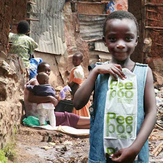
design*obsession : a well designed... portable toilet


i have to say... this is a pretty pee/poo bag. i love the idea + great design~ check it out!

:: peepoople ::

architecture*obsession : bird house anyone?


i wonder how much this house is? :p it's actually a tea house~ :)

:: Takasugi-an by Terunobu Fujimori // dezeen ::

i want : night owl press

omg! i want to snatch up all their stuff!! something about paper being actual wood is so... calming. :)

:: night owl press ::

3.30.2009

architecture*obsession : PACO!


oh maaaan. as first i didn't know what this was but now that i know... i would want one. not to live in it all the time... but just to have b/c of it's design. like a collectors item or something... besides, i guess as the title suggests "PACO. Small. Second. House" yes. it would be great~ maybe having a second vacation home isn't such a far fetched idea~ :p check it out!


:: paco ::

design*obsession : one man's treasure


A recent NPR story profiled an intriguing artist and entrepreneur named Justin Gignac. In that story, titled: “Treasure or Trash? Artist Says It’s in the Packaging”, Gignac puts forth a persuasive argument. While an intern at MTV, Gignac relates that he engaged in a discussion with his fellow workers. One of them expressed the opinion that “. . .they thought package design wasn’t important”, according to Gignac.
That made Gignac rise to the challenge. “So I figured the only way to prove them wrong would be to try to package something that absolutely nobody in their right mind would ever want to buy.” Garbage.
That was a few years ago. Since he began, Gignac has sold over 1000 trash cubes of--selective New York City garbage--around the globe. Making the cubes “compositionally appealing”, Gignac sold his cubes initially as “gag gifts” for $10 each. Now, the cubes sell for as much as $100. Each sealed box comes signed, numbered and tagged as “Garbage of New York City”. A small affixed sticker records the date the trash was selected for the cube.
The gist, according to Gignac? “People’s perceptions have completely changed.” Translation: while some people see nothing but trash, other people see art, especially since the cubes cost more now.
Besides his original venture, Gignac and girlfriend Christine Santora create paintings of items on their wish list—everything from pizza slices to financial security and price them according to the value of the real thing. . .I’m not sure how ‘financial security’ is depicted, but it’s an interesting concept. Gignac observed that sometimes people have a distorted view of what art is really worth. Or what really constitutes garbage? Or the value of garbage? One of his ideas, for example, is to create a 6 by 8 foot painting of a taco and sell it for $1.99, because “that’s what a taco costs.”
interesting idea~~
:: the dieline ::

3.24.2009

shopaholic : tortoise

been wanting to check out this store on abbot kinney (venice, ca) ... they carry cute japanese designed products~ have to make some time~~~

:: tortoise ::

3.15.2009

product*obsession : david stark for west elm

some creative way of reusing material~ and also presented in a beautiful way~ and i have to say... i am a huge fan of west elm furniture~ i would probably buy the whole store if i could~ :p


:: west elm // david stark ::

3.14.2009

i want : i need to either get one... or make one.


:: alphabet bags ::

eye blog article: the peter saville principle.

an interesting article on one of the most influential album cover artists in graphic design.... but i have to say... what really caught my eye recently from his work is his kate moss logo that i saw at the design museum in london. maaaaaan. when i saw it large and up on the wall... it made me truly believe how beautiful type can be... take a look and see~~


what do you think?

:: eye blog ~ peter saville ::

3.13.2009

obsession with packaging

so i know that i've posted a few things on packaging and continuously rave about how much i love it... but man. no matter how many times i look at it... i love it. LOVE IT. L.O.V.E. I.T. *sigh* i hope one day i could be a packaging maven... or specialist... or super hero. hahaha~ packaging superhero? ok. i don't know what i'm talking about anymore. anyways. here is some more inspiration that's making my blood flooooooow. yummy packaging. eat you up.


:: the dieline ::

product*obsession : band-aids

for these... i would PURPOSELY fall down just so i could put one on... or two. :p


:: fredflare ::

inspiration from boy fashion

although i love fashion for women, i tend to look at men's fashion for some inspiration time to time~ i think a mix of something cute n' flowy with an edgy tomboy x rocker definitely suits my inner girlie+tomboy meets music + design lover. :)

i love me some plaid sneaks // beams


chuck taylors are definitely a must // converse x comme des garcons

how can anyone go wrong w/ type on tees? // nom de guerre x fruit of the loom

i never knew a huge sweatshirt could be so fashionable! // adidas originals

and what outfit would be complete without a lollipop? // massimo gammacurta

3.12.2009

type cowboyyeeee!

shoot em up if you want to be the sheriff of los fontageles.

product*obsession : too cute to resist

i don't think that all design has to have a deep meaning.... esp for this one. i think it's cute and makes you smile... and if it makes someone happy i think that is more than what others can say about the things they produce.


omg. the packaging is so cute!

can something so cruel be so cute? :)

3.09.2009

what the heck were they thinking!

hahahahaa!


3.07.2009

studio {love} : dirty vegas + YES studio (UK)

i was always intrigued by the dirty vegas album covers but never knew who did them... now i know~ :) and their work is beautiful~

YES is located in london, uk... something about UK design firms and the work they do i am in love with. so many good studios. good work. sigh.. i miss london. and their design. i miss salisbury. i miss topshop. i miss the rainy weather. i miss the architecture. i want to go to RCA. my parents lived there for awhile before i was born. i fell in love with the place the first time i went there. i want to go back.

YES

craving cupcakes

for some reason.. i've been craving for some GOOD cupcakes... and although i would want nothing but to invite some girlfriends over for some homemade cupcakes and tea~ for now, i can definitely :) with a cupcake from a cute store. i am such a sucker for a cute design-y store + cupcakes. oh my.

some stores on my radar:


Buttercake Bakery


anyone want to go check some out? :) oh maaaan... i am craving.

3.05.2009

eye candy : inspirational images for thursday


experimental jetset // beautiful

love this type treatment

colors galore!

ornamental pattern design

i don't know what nupo is but i would love to find out :)

i love 3D

3.02.2009

i am lovin' the bookcases + interior decor


this is only 815 sq. ft of space~ looks like good use of space~

i would LOVE this bookcase... mine is overflowing. :(

cute wall graphics~

a type carpet~ and even better... hand drawn type!